 Website Update 2023


 Offline
Forum
 Website Update 2023
Like it

Nice work You did man it looks amazing and fresh. I have been surprised, maybe this is a step forward and we will be surprised CS2D rewriting one day(dreams)
After this website update, the website is now lag af
My PC need some help aaa
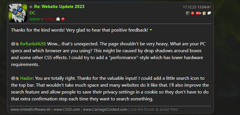
 DC
DC Concerning the search, I wanted to suggest making it more prominent (if possible) - I feel like putting it behind a hover had made it less accessible, and could thus lead to even less people finding it.
But maybe just giving everything in the top bar more space is all it really needs (and maybe all that's is easily doable, given the extra GDPR compliance steps).

@
forfunlol420 -Quited-: Wow... that's unexpected. The page shouldn't be very heavy. What are your PC specs and which browser are you using? This might be caused by drop shadows around boxes and some other CSS effects. I could try to add a "performance"-style which has lower hardware requirements.@
Hador: You are totally right. Thanks for the valuable input! I could add a little search icon to the top bar. That wouldn't take much space and many websites do it like that. I'll also improve the search feature and allow people to save their privacy settings in a cookie so they don't have to do that extra confirmation step each time they want to search something. When clicking a rule reference (
 §1.1 - No illegal contents (incl. endorsement, cracks/pirate copies) for example), the Nav bar hides until scrolling all the way to the top/bottom.
- The Spam Cooldown(tm) popup window (when mouse hovering over it) is showing at the wrong location sometimes. The popup window sometimes has a very large distance to the mouse


- The URL in the BB img-tag is not excluded from anti spam rules. If a link contains (e.g.) 5x "g" in a row, I get a UnrealSoftware Error upon posting "Too many identical letters in a row". Following:
1
[img] https://i.ibb.co/hZbx70V/bugggggg.png [/img]
 Anyways, thanks DC for the website rebrand and all of your hard work you do on the community, the new layout does look quite decent and fresh anew.
I noticed the forum moderation buttons are kinda out of place, with the temporary ban feature being on the left and all the rest of the moderation features on the right. It wasn't like that before with the old layout. Is it intentional?
Also when clicking on a rule which will show the list of all forum rules, the "X" button is misplaced.
 DC has written
Respecting EU laws (GDPR) by not sending any data to third parties without user consent
I know this has been talked about quite a lot of times lately but since the website refurbishment now abides by GDPR laws as per your say, does that mean it will be possible in the foreseeable future to deactivate or delete one's account?
The text is now green. I don't remember it being green, but now all of it is!
Oh, speaking of green, this is my favorite shade of it: https://www.color-hex.com/color/05f97e
It looks great against a dark background. Would be good for text or smth.
Also, for pc, things could be a liiiitle bit wider. I know it's probably the same width, but my brain refuses to listen, and I'm probably not the only one.
Also... wait, I can't scroll while writing this comment? Uhhh... that too.
The buttons could maybe be a bit less flat looking, and less like... green
Oh, the emojis need to be shown bigger in the emoji grouping, when you click the emoji button.
Also, the portal page feels less... powerful, for lack of better words. It feels like it is more restricted, less relaxed.
Also, entirely random idea, is it possible to integrate this with notifications?
wait... now I can scroll. What is going on? This website is gaslighting me.
ModJuicer has writtenwait... now I can scroll. What is going on? This website is gaslighting me.
I seriously can relate to that. I'm not able to quote your comment anymore even though I denied to answer without your quote, expecting to have your entire post so I can answer it.
Also going back from commenting to the topic redirects you to the first page sometimes, although I've been on another before (2nd Page in this topic).

And yes, there's a mean scrollbar bug. When choosing a smiley for instance, the scrollbar doesn't come back. Will fix that soon. You can simply open and close the overlay again to get the scrollbar back.
@
Bowlinghead: Oh wow. That link multi letter issues must have existed all the time, even with the old page 
@
GeoB99: Yes, changed positions of mod buttons is intended. The logic is now: directly user related buttons are next to the user name content related buttons are on the right of the content box
The account delete function has no priority but will come some day I guess. Until then people can contact me if they really wont their stuff to be removed. This really doesn't happen often.
@
ModJuicer: Actually (optional!) push notifcations is something I looked into and that I plan to add later! Would be a fun feature to see.
ModJuicer:Maybe it could have a dark twist and use the usernames of banned users

Edit:
This should be pink too:
 Mami Tomoe Great idea!
Here are some prominent examples from the past:
JewishNazi ur mom gay Iliketolookatgayporn9 ImSoFuckingRetarded StupidHobbit BigCockNiggerPenis69 DC is a nigger NiggersTongueMyAnus DCSucksNaziCock HitlerDidNothingWrongGranted, not everyone of them is banned but a bunch of them are names just like these.
Chingy Crikey. Point taken.Anyway, I think having a single purpose built profile would result in a profile which is generally better in appearance. I personally would rather see something creatively named and with a cool profile pic than some random old user name. Plus, idk if people banned would want their user names used for that purpose anyway.